




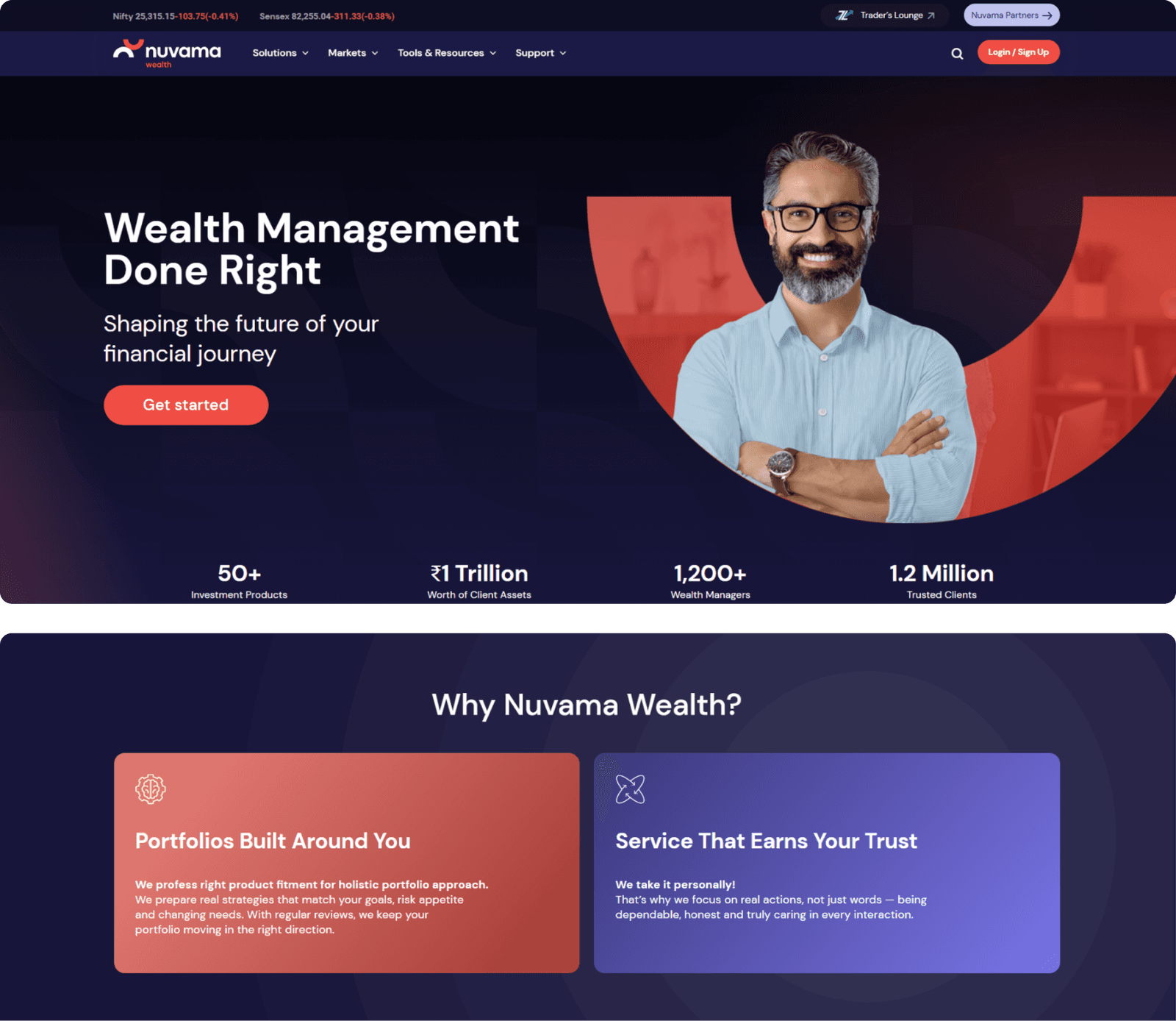
A clearer way for clients to explore advisory services and investment solutions.
What we did for Nuvama Wealth
 Structured service architecture for advisory offerings
- Separate advisory and portfolio sections
- Research listings organised for quick scanning
- Clear adviser contact routes on every page
- Office network presented by region
- Responsive layouts across desktop and mobile

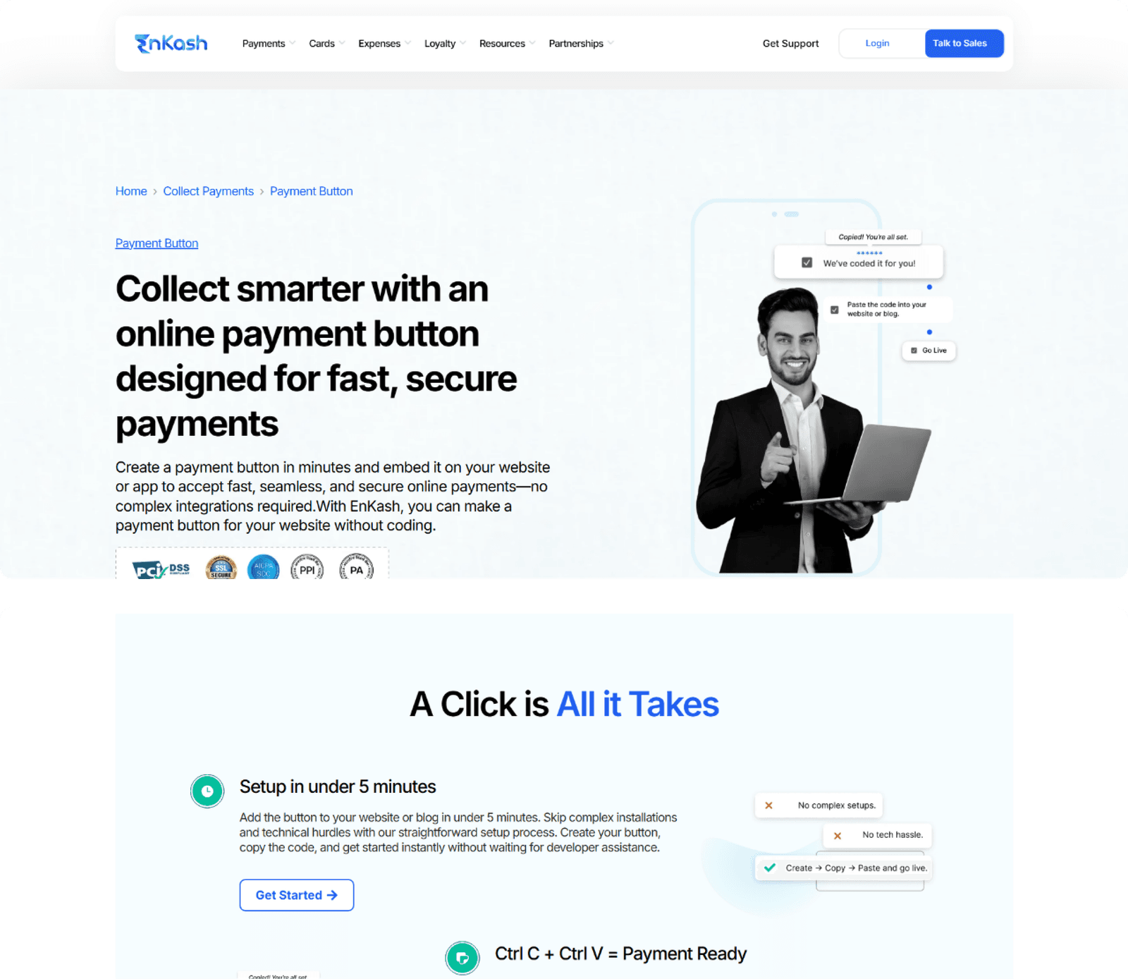
Presenting a full spend management and payments suite to Indian finance teams.
What we did for Enkash
- Product suite split into separate pages
- Solution routes organised by business role
- Corporate cards and expense pages structured clearly
- Payables and collections given dedicated sections
- Demo requests reachable from every screen
- Responsive layouts across desktop and mobile

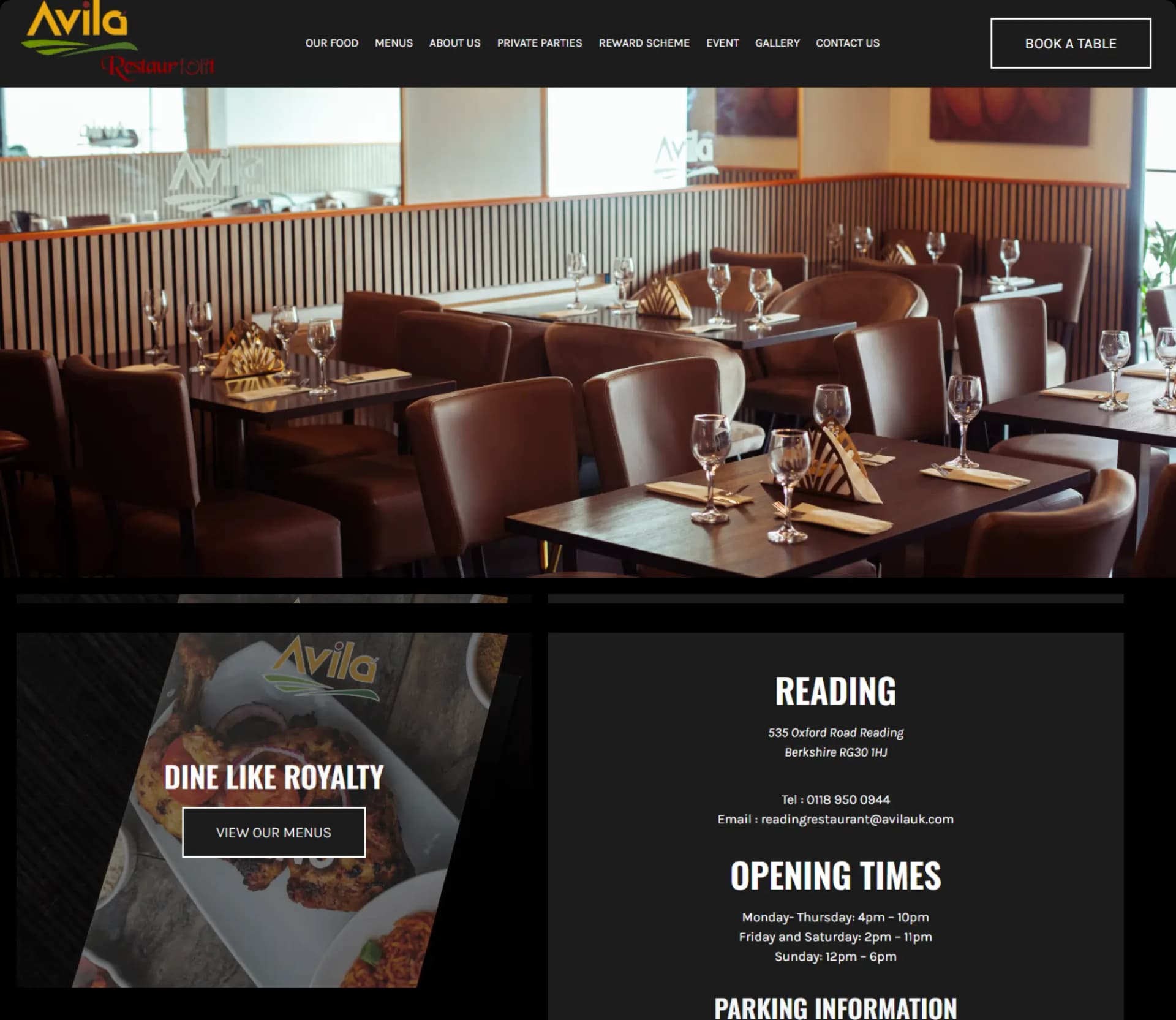
Bringing Avila's Afro-Caribbean menu, private parties and table bookings together on one site built for Reading diners.
What we did for Avila Restaurants
- Menu pages readable on a phone
- Book-a-table flow built into the site
- Private party and event enquiry forms
- Photo gallery for the dining room
- Reward scheme details for regular diners
- Clear links across to sister brands

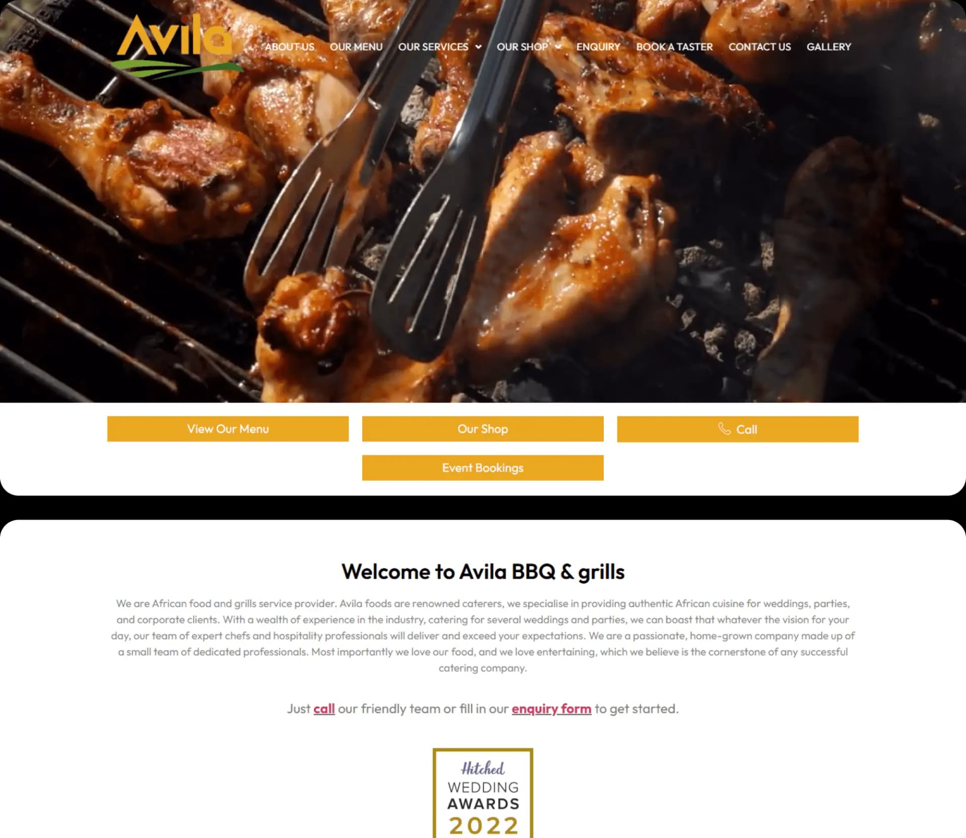
Catering enquiries and a marinated meat shop in one site.
What we did for Avila BBQ And Grills
- WooCommerce store for chilled marinated meat
- Ready-to-eat and ready-to-grill categories
- Catering pages for weddings and carnivals
- Equipment rental listings with enquiry forms
- Taster booking form for prospective clients
- Responsive checkout across desktop and mobile

Explaining a sales execution platform clearly enough that revenue leaders see how it works.
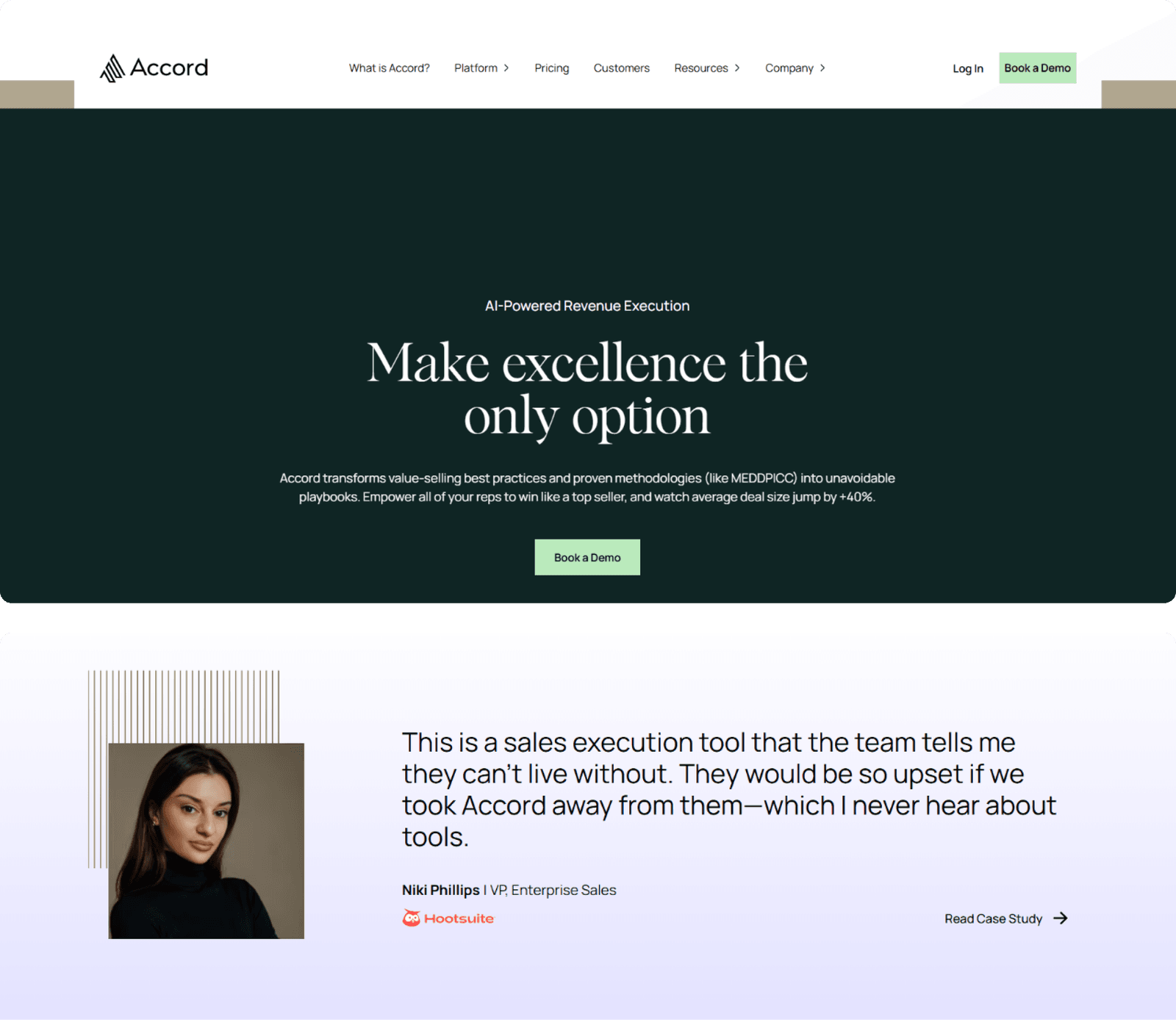
What we did for Accord
- Set, enforce and score model walked through
- Dedicated page for each platform capability
- Product screens supporting every feature page
- Mutual action plan content given its own section
- Demo request reachable throughout the site
- Responsive layouts across desktop and mobile

Making a broad background verification and KYC portfolio navigable.
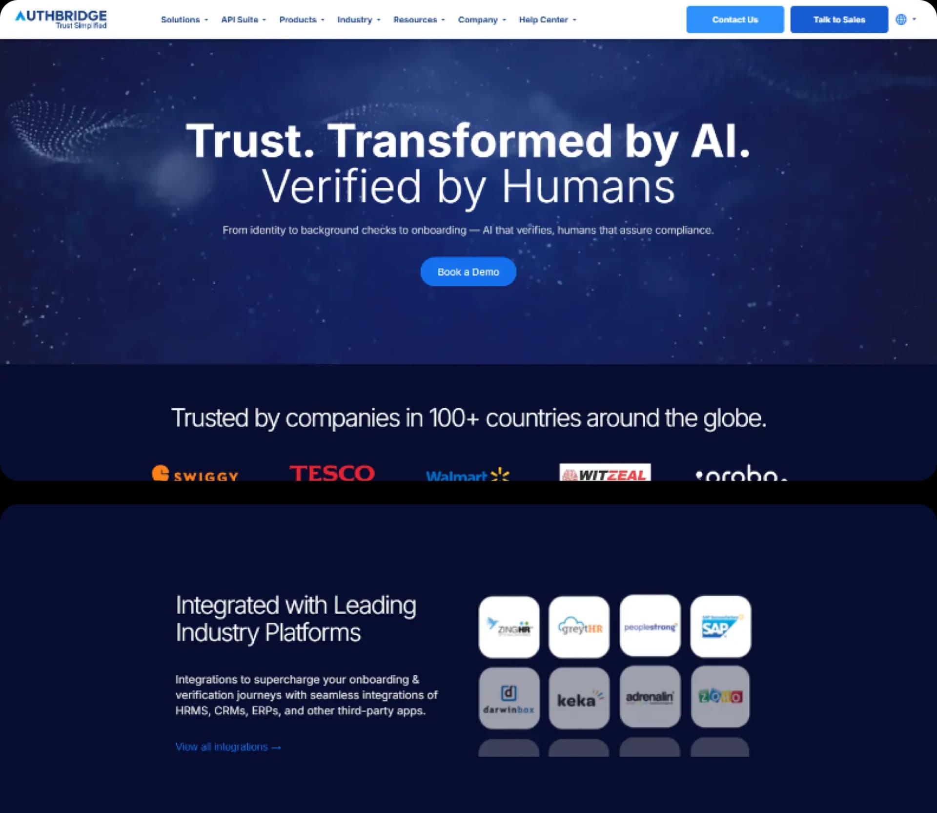
What we did for Authbridge
- Product-led navigation for enterprise buyers
- Dedicated page for each verification check
- KYC and due-diligence content separated clearly
- Buyer groups routed to relevant services
- Compliance detail kept readable on mobile
- Responsive layouts across desktop and mobile

A study abroad site students can actually navigate.
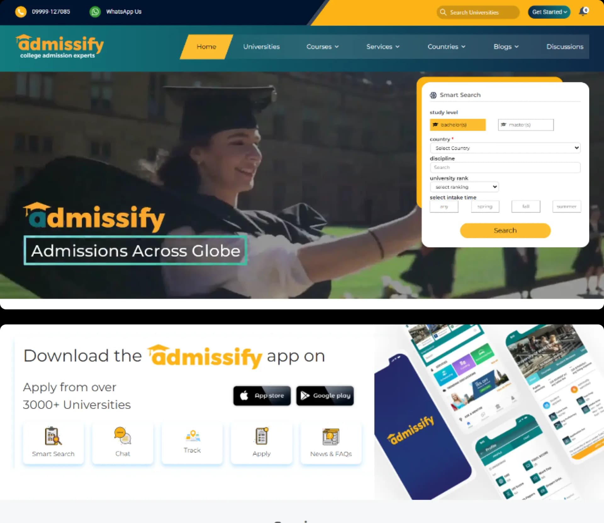
What we did for Admissify
- Site organised by country, university and course
- Service pages for counselling and test preparation
- Scholarship, visa and loan guidance sections
- Counselling enquiry forms throughout the site
- Accommodation support given its own page
- Mobile-first layouts for student browsing

A booking-led website for the gown supplier behind Irish graduations.
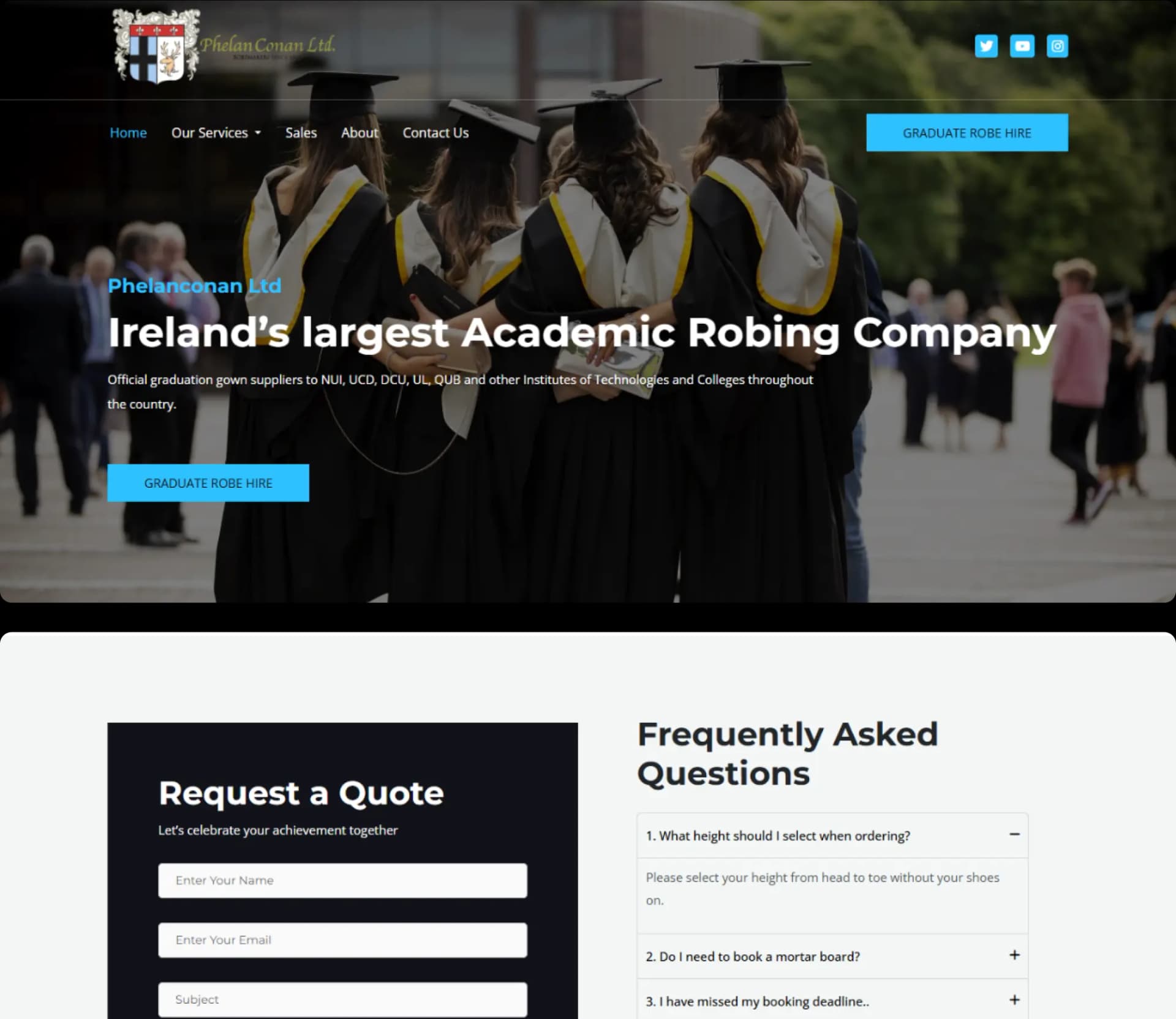
What we did for Phelan Conan
- Every institution and ceremony listed separately
- Robe details and hire prices per ceremony
- Students routed into matching booking forms
- Students routed into matching booking forms
- Conferring-season enquiries handled online
- Responsive layouts across desktop and mobile

A clearer product site for a logistics software group.
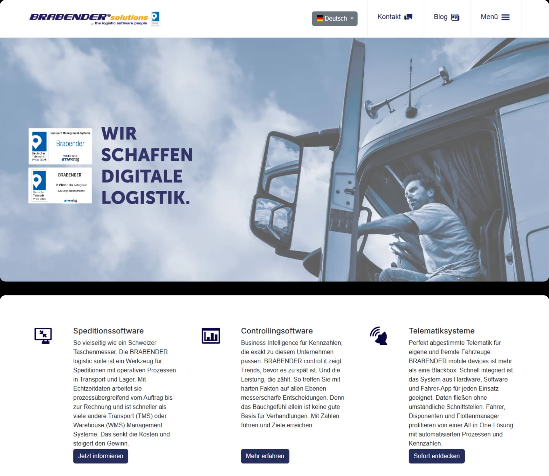
What we did for Brabender
- A section for each product suite
- Dispatch features of logistic suite detailed
- Controlling module documented separately
- Telematics hardware and driver app sections
- Consistent feature and use-case page structure
- Layouts that stay readable on phones

A marketplace site where independent artists list music cards and fans buy into the songs.
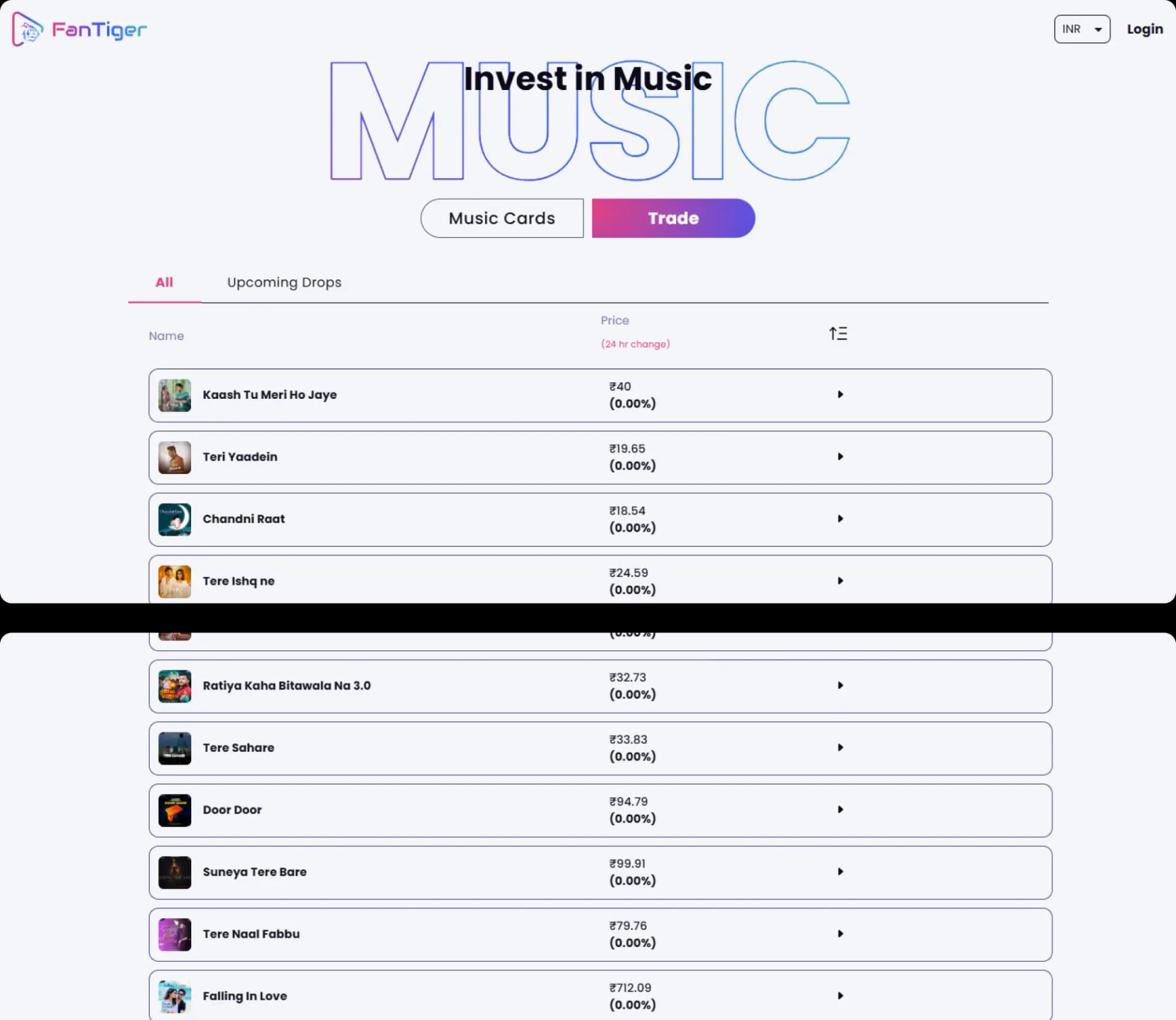
What we did for Fan tiger
- Artist and song pages carrying drop details
- Card grid for browsing new releases
- Plain-language explainers on ownership and royalties
- Filtering and search across available drops
- Purchase flow built for mobile browsing
- Responsive marketplace front-end throughout
Ready to Scale Your Business?
Book a free consultation to get clarity, direction, and expert advice you can implement right away.